SK SPV Klášterec nad Ohří
The JesterServes Children and young adults interested in gymnastics
What Drives Them
Finds joy in the moment. Connects through humor and lightheartedness.
The brand emphasizes teamwork, community, and fun, with a youthful and enthusiastic personality. The homepage excerpt and signature words suggest a local, community-driven gymnastics club.
Color Intelligence
SK SPV Klášterec nad Ohří anchors on Yellow (#d8e483) as their primary brand signal, paired with Yellow (#ccdc5e), and accented by Yellow. The palette leans warm — inviting and energetic.
#d8e483
Primary
#ccdc5e
Secondary
#f5f8d5
Accent
#c4d83c
Accent
#e6eda9
Accent
#a3ac5f
Accent
Typography
Headings set in Nanum Myeongjo (a serif — evoking tradition, authority, and print heritage), body in calibri !important (a sans-serif — clean, modern, and optimized for digital). This serif/sans pairing creates classic typographic contrast. 3 typeface families in play — a richer, more layered typographic system.
Logo Anatomy
SK SPV Klášterec nad Ohří uses a combination mark — pairing symbol with wordmark for versatility. Moderate detail — balancing distinctiveness with versatility. Style: playful, friendly, modern.
Combination Mark
circle
Icon + Text
5/10
Brand Character
SK SPV Klášterec nad Ohří is casual and conversational, warm and approachable, energetic and passionate — also simply spoken and accessible.
first_plural
elementary
playful
Signature Words
Design Playbook
action shots, candid, group photos
natural
bright
flat
dropdown
rounded
generous
image_carousel
Digital Footprint
Built on WordPress, active on 3 social platforms.
Market Presence
Local market, headquartered in Klášterec nad Ohří, CZ.
CZ
Klášterec nad Ohří, CZ
local
cs
SK SPV Klášterec nad Ohří is a trademark of its respective owner. Bivernado is not affiliated with, endorsed by, or sponsored by SK SPV Klášterec nad Ohří. All brand data shown here is collected from publicly available sources and analyzed for informational and research purposes under fair use principles. Request removal →
Logo Variants
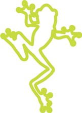
Primary Raster
Primary LogoPrimary shape: circle
Brand Codes
Žabičky
The club is nicknamed 'Žabičky' (Frogs), and the frog imagery is used in the logo and branding.
Czech Flag Colors
The website uses colors reminiscent of the Czech flag (blue, red, white).
2023 Founding Year
The organization was founded in 2023.
Bright White
The website uses a clean, bright white (#ffffff) as a primary color for backgrounds and text.
More brands in Sports
Explore other brands in this industry to compare visual identities.