Domov u studánky
Serves Individuals with disabilities and their families in the Pardubice region.
What Drives Them
The brand's mission, values, and website content emphasize enabling individuals with disabilities to live independently while receiving the necessary support. This balance is key to their positioning.
Posláním Domova u studánky je zlepšovat kvalitu života lidí s postižením , podporovat jejich růst, rozvoj schopností a zachování samostatnosti, motivovat klienty v řešení jejich nepříznivé sociální situace a napomáhat jim při sociálním začleňování.
Color Intelligence
Domov u studánky anchors on Blue (#3489b3) as their primary brand signal, paired with Blue (#03365f), and accented by Blue. The palette leans cool — projecting trust and professionalism.
#3489b3
Primary
#03365f
Secondary
#74bfe6
Accent
#85a0aa
Accent
#4a524f
Accent
#f7f8f9
Background
Typography
Logo Anatomy
Brand Character
Design Playbook
Digital Footprint
.
Market Presence
Nationwide presence, based in CZ.
CZ
national
cs
Domov u studánky is a trademark of its respective owner. Bivernado is not affiliated with, endorsed by, or sponsored by Domov u studánky. All brand data shown here is collected from publicly available sources and analyzed for informational and research purposes under fair use principles. Request removal →
Products & Business
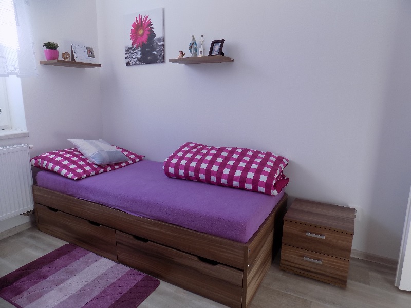
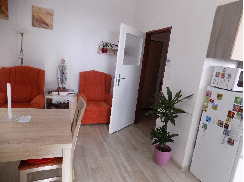
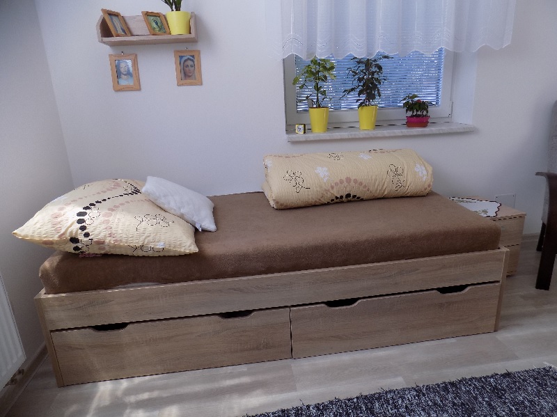
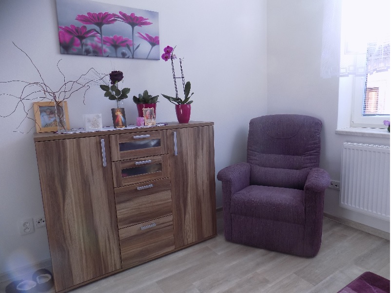
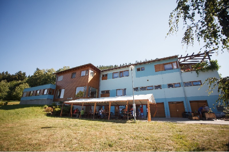
Chráněné bydlení
Domov pro osoby se zdravotním postižením
Odlehčovací služby
Sociálně-terapeutické dílny
Ubytování pro rekreační účely
More brands in Social Services
Explore other brands in this industry to compare visual identities.