Ing. Bohdan Matwikow
“Neléčte se, uzdravte se (Don't treat yourself, heal yourself)”
Serves Individuals seeking alternative treatments for civilizational diseases and a healthier lifestyle
What Drives Them
Color Intelligence
Ing. Bohdan Matwikow anchors on Blue (#d3ebe8) as their primary brand signal, paired with Green (#b9d8cc), and accented by Green. The palette leans cool — projecting trust and professionalism.
#d3ebe8
Primary
#b9d8cc
Secondary
#9ecba5
Accent
#0097f5
Accent
#c1c56b
Accent
#dee6a8
Accent
Typography
Logo Anatomy
Ing. Bohdan Matwikow uses a combination mark — pairing symbol with wordmark for versatility.
Combination Mark
Icon + Text
Brand Character
Design Playbook
Digital Footprint
.
Market Presence
Nationwide presence, based in CZ.
CZ
national
cs
Ing. Bohdan Matwikow is a trademark of its respective owner. Bivernado is not affiliated with, endorsed by, or sponsored by Ing. Bohdan Matwikow. All brand data shown here is collected from publicly available sources and analyzed for informational and research purposes under fair use principles. Request removal →
Logo Variants
Primary Raster
Primary LogoBrand Codes
Stacked stones
A stack of smooth, dark stones balanced on top of each other, often associated with zen and balance, is prominently featured.
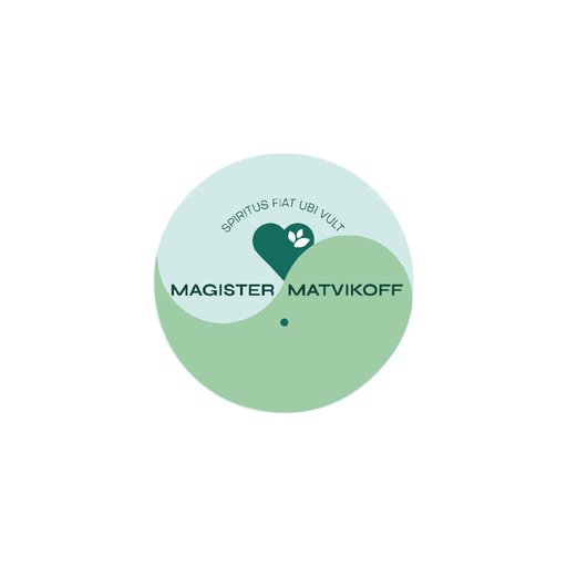
Yin-yang circle
A yin-yang circle with a heart and leaf inside.
Products & Business
Kurzy vaření (Cooking courses)
Léčebné pobyty v Beskydech (Therapeutic stays in Beskydy)
Omlazování organismu (Rejuvenation of the organism)
More brands in Alternative Medicine
Explore other brands in this industry to compare visual identities.