M-Tronic
The RulerWhat Drives Them
Organized and dependable. Creates order and stability.
Color Intelligence
and accented by Gray. The palette leans warm — inviting and energetic.
#646464
Accent
#9e9e9d
Accent
#d6d5d3
Accent
#141414
Text
#3c3c3c
Text
#fbfbfb
Background
Typography
Single-font system — disciplined and consistent.
Logo Anatomy
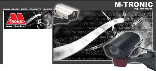
M-Tronic uses a combination mark — pairing symbol with wordmark for versatility.
Combination Mark
Icon + Text
Brand Character
M-Tronic is formal and professional, authoritative and decisive, cool and detached — also technically detailed.
third
high_school
direct
Signature Words
Design Playbook
Digital Footprint
.
Market Presence
Local market, based in CZ.
CZ
local
cs
M-Tronic is a trademark of its respective owner. Bivernado is not affiliated with, endorsed by, or sponsored by M-Tronic. All brand data shown here is collected from publicly available sources and analyzed for informational and research purposes under fair use principles. Request removal →
Logo Variants

Primary Raster
Primary LogoBrand Codes
Dark Gray
Used for the main text and some background elements, #141414.
Verdana
Simple and readable font used throughout the website.
Ing. Jiri Marek
The website is named after and likely features the founder.
M-Tronic Logo Shape
The M-Tronic logo features a stylized letter 'M' with a bold, geometric design, creating a distinctive shape.
More brands in Electronics
Explore other brands in this industry to compare visual identities.