Maira masáže
The Caregiver“ZVU VÁS PROŽÍT barvy a roviny života … Hledání kořenů bytí ve spojení se silným místem … Zažít svobodu s přírodou … Laskavě projít rituály … Pospolitost žen … Držet bezpečný prostor … Putování krajinou a inspirace z ní …”
Serves Women seeking holistic wellness and connection with nature
What Drives Them
Puts people first. Builds trust through genuine care.
Color Intelligence
Maira masáže anchors on a muted Blue (#a7c3c0) as their primary brand signal, paired with Orange (#5d4404), and accented by Orange. The palette leans warm — inviting and energetic.
#a7c3c0
Primary
#5d4404
Secondary
#88765e
Accent
#606f1d
Accent
#9f8f54
Accent
#a6b65f
Accent
Typography
Headings set in ETmonarch (a serif — evoking tradition, authority, and print heritage), body in Open Sans (a sans-serif — clean, modern, and optimized for digital). This serif/sans pairing creates classic typographic contrast. 3 typeface families in play — a richer, more layered typographic system.
Logo Anatomy
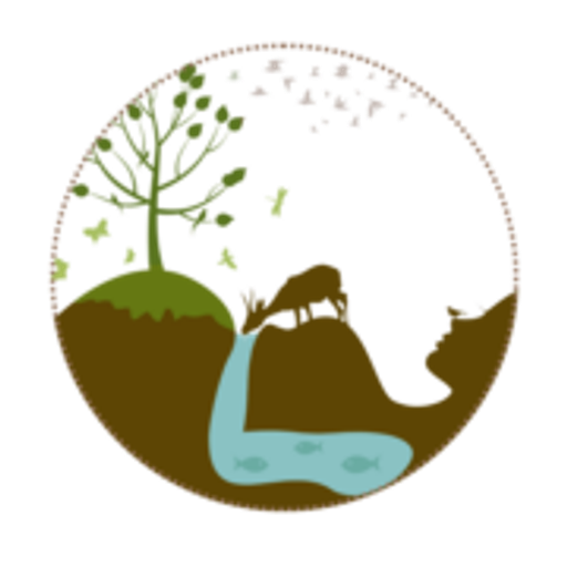
Maira masáže uses a combination mark — pairing symbol with wordmark for versatility.
Combination Mark
Icon + Text
Brand Character
Maira masáže is warm and approachable, energetic and passionate, simply spoken and accessible.
first_singular
high_school
soft
Signature Words
Design Playbook
Nature, Lifestyle
natural
vibrant
flat
dropdown
rounded
generous
Digital Footprint
Built on WordPress, active on 1 social platform.
Market Presence
Local market, headquartered in Brno, CZ.
CZ
Brno, CZ
local
cs
Maira masáže is a trademark of its respective owner. Bivernado is not affiliated with, endorsed by, or sponsored by Maira masáže. All brand data shown here is collected from publicly available sources and analyzed for informational and research purposes under fair use principles. Request removal →
Logo Variants
Primary Raster
Primary LogoBrand Codes
Muted Teal
Used for accents and backgrounds, creating a calming and natural feel.
ETmonarch
Elegant and slightly vintage font used for headings.
Founder Figure
The founder's face is prominently featured on the website, suggesting she is a key part of the brand's identity.
Nature-based Logo
The logo features a hand-drawn style illustration of a natural scene with a tree, water, and earth, suggesting a connection to nature.
Ethereal Photography
The photography style features soft lighting and natural settings, creating an ethereal and calming atmosphere.
Social Media Intelligence
More brands in Wellness
Explore other brands in this industry to compare visual identities.