Masáže Jitka
The CaregiverServes Local residents seeking massage therapy for relaxation and health benefits.
What Drives Them
Puts people first. Builds trust through genuine care.
Color Intelligence
Masáže Jitka anchors on Green (#54b557) as their primary brand signal, paired with Orange (#dc7131), and accented by Red. The palette leans warm — inviting and energetic.
#54b557
Primary
#dc7131
Secondary
#c74e28
Accent
#dd9730
Accent
#94432e
Accent
#442423
Accent
Typography
Masáže Jitka uses Poppins across both headings and body — a sans-serif — clean, modern, and optimized for digital. Single-font system — disciplined and consistent.
Logo Anatomy
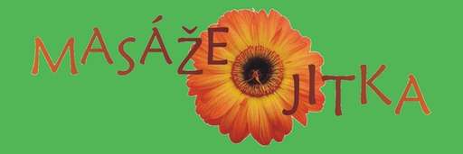
Masáže Jitka uses a combination mark — pairing symbol with wordmark for versatility.
Combination Mark
Icon + Text
Brand Character
Masáže Jitka is warm and approachable, energetic and passionate, simply spoken and accessible.
first_singular
middle_school
soft
Signature Words
Design Playbook
Digital Footprint
active on 1 social platform.
Market Presence
Local market, headquartered in Česká Třebová, CZ.
CZ
Česká Třebová, CZ
local
cs
Masáže Jitka is a trademark of its respective owner. Bivernado is not affiliated with, endorsed by, or sponsored by Masáže Jitka. All brand data shown here is collected from publicly available sources and analyzed for informational and research purposes under fair use principles. Request removal →
Logo Variants

Primary Raster
Primary LogoBrand Codes
Light Green (#52b652)
Used for accents and highlights, creating a sense of natural wellness.
Poppins
Modern and clean font used throughout the website, reflecting a contemporary approach.
Jitka
The business is named after the founder.
Hand-drawn font
The logo uses a hand-drawn style font with rounded edges and a slightly irregular appearance.
Gerbera flower
The logo incorporates a gerbera flower, which is used as a visual element.
Social Media Intelligence
More brands in Wellness
Explore other brands in this industry to compare visual identities.