What Drives Them
Puts people first. Builds trust through genuine care.
Color Intelligence
Miniškolka KATKA anchors on a muted Blue (#89a3b5) as their primary brand signal, paired with Orange (#e4c1a5), and accented by Red. The palette leans warm — inviting and energetic.
#89a3b5
Primary
#e4c1a5
Secondary
#e82146
Accent
#c77467
Accent
#1a7c8f
Accent
#f5d814
Accent
Typography
Headings set in poppins-semibold (a sans-serif — clean, modern, and optimized for digital), body in poppins (a sans-serif — clean, modern, and optimized for digital).
Logo Anatomy
Miniškolka KATKA uses a combination mark — pairing symbol with wordmark for versatility.
Combination Mark
Icon + Text
Brand Character
Miniškolka KATKA is casual and conversational, warm and approachable, energetic and passionate — also simply spoken and accessible.
first_plural
elementary
playful
Signature Words
Design Playbook
bright, candid
natural
full_color
flat
horizontal
rounded
loose
image
Digital Footprint
Built on Wix, active on 2 social platforms.
Market Presence
Local market, headquartered in Prague, CZ.
CZ
Prague, CZ
local
cs
Miniškolka KATKA is a trademark of its respective owner. Bivernado is not affiliated with, endorsed by, or sponsored by Miniškolka KATKA. All brand data shown here is collected from publicly available sources and analyzed for informational and research purposes under fair use principles. Request removal →
Logo Variants
Primary Raster
Primary LogoBrand Codes
Bright Red
Used in the logo and as a highlight color throughout the website.
Poppins
Used for headings and body text, providing a friendly and approachable feel.
Simple Flower Illustrations
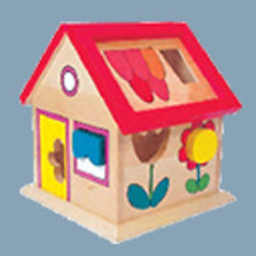
The image features simple, colorful flower illustrations on the side of the wooden house toy, suggesting a playful and child-friendly aesthetic.
House Shape Sorter
The wooden house shape sorter with a red roof and various shaped holes is a distinctive shape.
House Shape
The house shape itself, used as a toy, could be a signature shape representing the brand's focus on early childhood education and play.
Social Media Intelligence
Miniškolka Katka, Praha. 38 To se mi líbí. Miniškolka rodinného typu pro nejmenší děti se zaměřením individuální přístup a respektující výchovu.
More brands in Education
Explore other brands in this industry to compare visual identities.



