Mateřská škola Letná Vrchlabí
The CaregiverServes Parents of preschool-aged children
What Drives Them
Puts people first. Builds trust through genuine care.
The brand emphasizes care through its values, personality, and voice profile (high warmth). The focus on children and community further reinforces this core attribute.
Color Intelligence
Mateřská škola Letná Vrchlabí anchors on Green (#6ac379) as their primary brand signal, paired with Pink (#f278a0), and accented by Green. The palette balances warm and cool tones.
#6ac379
Primary
#f278a0
Secondary
#66976b
Accent
#c6e8fa
Accent
#000000
Background
#fdfdfd
Background
Typography
Headings set in Kalam (a handwritten style — projecting personality and human warmth), body in Open Sans (a sans-serif — clean, modern, and optimized for digital). 4 typeface families in play — a richer, more layered typographic system.
Logo Anatomy
Brand Character
Mateřská škola Letná Vrchlabí is casual and conversational, warm and approachable, energetic and passionate — also simply spoken and accessible.
third
elementary
soft
Signature Words
Design Playbook
candid, daylight
natural
full_color
flat
horizontal
rounded
comfortable
slider
Digital Footprint
Built on WordPress, active on 1 social platform.
Market Presence
Local market, headquartered in Vrchlabí, CZ.
CZ
Vrchlabí, CZ
local
cs
Mateřská škola Letná Vrchlabí is a trademark of its respective owner. Bivernado is not affiliated with, endorsed by, or sponsored by Mateřská škola Letná Vrchlabí. All brand data shown here is collected from publicly available sources and analyzed for informational and research purposes under fair use principles. Request removal →
Brand Codes
Founding Year
References to the school's founding in 2007.
Czech Language
Website is primarily in Czech, reflecting local culture.
Bright Blue
Consistent use of #00a8ff for links and accents.
Products & Business
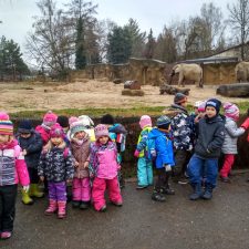
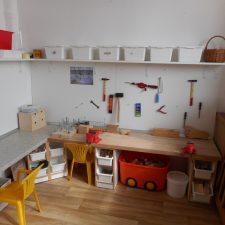
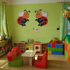
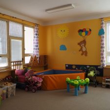
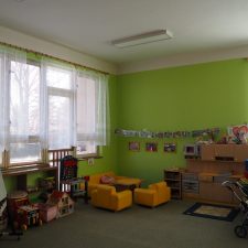
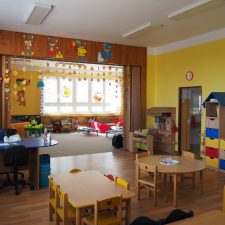
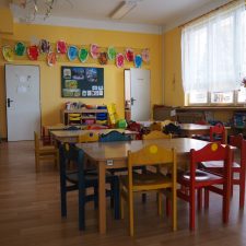
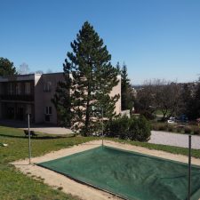
Showing 8 of 10 product images
More brands in Education
Explore other brands in this industry to compare visual identities.



