
Neumanna s.r.o
The InnocentServes Households and businesses seeking quality textiles
What Drives Them
Values simplicity and honesty. Trusted for being genuine.
Color Intelligence
The palette leans warm — inviting and energetic.
#cccccc
Background
#fcfcfc
Background
#353535
Text
#686868
Background
#1a1a1a
Text
#989898
Background
Typography
Single-font system — disciplined and consistent.
Logo Anatomy
Neumanna s.r.o uses a combination mark — pairing symbol with wordmark for versatility.
Combination Mark
Icon + Text
Brand Character
Neumanna s.r.o is formal and professional, authoritative and decisive.
first_plural
middle_school
direct
Signature Words
Design Playbook
product photography
natural
full_color
flat
horizontal
rounded
comfortable
image
Digital Footprint
Built on Bootstrap.
Market Presence
Nationwide presence, headquartered in Červený Kostelec, CZ.
CZ
Červený Kostelec, CZ
national
cs
Neumanna s.r.o is a trademark of its respective owner. Bivernado is not affiliated with, endorsed by, or sponsored by Neumanna s.r.o. All brand data shown here is collected from publicly available sources and analyzed for informational and research purposes under fair use principles. Request removal →
Logo Variants

Primary Raster
Primary LogoBrand Codes
Regional Origin
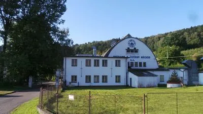
References to Lhota za Červeným Kostelcem, the town where the company is located.
Cream
Consistent use of a cream color (#fef2d4) in backgrounds and accents.
Product Category Focus
Emphasis on product categories like 'Ložní prádlo' (Bedding), 'Froté prádlo' (Terry Cloth), and 'Stolní prádlo' (Table Linen).
Lotus-like logo
A white lotus-like logo with three stylized petals intertwined in a circular fashion.
Products & Business



More brands in Textiles
Explore other brands in this industry to compare visual identities.