Spolek Prokop Příbram
The Innocent“Spolek Prokop Příbram”
Serves Residents of Příbram
What Drives Them
Values simplicity and honesty. Trusted for being genuine.
Color Intelligence
Spolek Prokop Příbram anchors on Green (#108f40) as their primary brand signal, paired with Orange (#d1b07e). The palette leans cool — projecting trust and professionalism.
#eeedef
Background
#108f40
Primary
#d1b07e
Secondary
#b2b2b2
Background
#030403
Background
#0d4e24
Background
Typography
Headings set in Actor (a sans-serif — clean, modern, and optimized for digital), body in Open Sans (a sans-serif — clean, modern, and optimized for digital). 3 typeface families in play — a richer, more layered typographic system.
Logo Anatomy
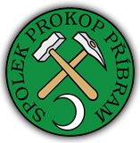
Spolek Prokop Příbram uses a combination mark — pairing symbol with wordmark for versatility.
Combination Mark
Icon + Text
Brand Character
Spolek Prokop Příbram is formal and professional, warm and approachable, simply spoken and accessible.
third
high_school
formal
Signature Words
Design Playbook
Digital Footprint
Built on WordPress.
Market Presence
Local market, headquartered in Příbram, CZ.
CZ
Příbram, CZ
local
cs
Spolek Prokop Příbram is a trademark of its respective owner. Bivernado is not affiliated with, endorsed by, or sponsored by Spolek Prokop Příbram. All brand data shown here is collected from publicly available sources and analyzed for informational and research purposes under fair use principles. Request removal →
Logo Variants
Primary Raster
Primary LogoBrand Codes
Forest Green
Used in the logo and as a background for some sections.
Mining Symbolism
References to mining history and traditions of the Příbram region.
Actor
Used for headings, giving a slightly theatrical feel.
Mining Hammers
The crossed mining hammers and crescent moon are a cultural symbol representing the mining heritage of Příbram.
More brands in Nonprofit
Explore other brands in this industry to compare visual identities.