Charita Strážnice
Serves people in need, elderly, disabled
What Drives Them
Charita Strážnice emphasizes providing services with compassion, support, and a community focus. The detailed pricing and procedural information on their website further highlight their careful approach to service delivery.
Color Intelligence
Charita Strážnice anchors on a vivid Red (#b51401) as their primary brand signal, paired with Red (#f7e8e7), and accented by Red. The palette leans warm — inviting and energetic.
#b51401
Primary
#f7e8e7
Secondary
#d16d63
Accent
#cf0000
Accent
#be3122
Accent
#e6b1ab
Accent
Typography
Logo Anatomy
Charita Strážnice uses a combination mark — pairing symbol with wordmark for versatility.
Combination Mark
Icon + Text
Brand Character
Design Playbook
Digital Footprint
.
Market Presence
Nationwide presence, based in CZ.
CZ
national
cs
Charita Strážnice is a trademark of its respective owner. Bivernado is not affiliated with, endorsed by, or sponsored by Charita Strážnice. All brand data shown here is collected from publicly available sources and analyzed for informational and research purposes under fair use principles. Request removal →
Logo Variants

Primary SVG
Primary LogoBrand Codes
Cross-Petal Icon
A red cross with stylized petal-like shapes emanating from each arm, resembling a flower or sunburst.
Products & Business

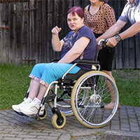






Showing 8 of 12 product images
Compensation Aid Rental
Field Social Rehabilitation
Food and Material Aid
Home Care Services
Protected Workshop Products (ceramics, textiles, wood)
Socially Therapeutic Workshop Services
More brands in nonprofit
Explore other brands in this industry to compare visual identities.