Dobročinný spolek Mácháček
The Caregiver“Dobročinný spolek Mácháček – v létě TÁBORY v zimě DIVADLO”
Serves Children and their families
What Drives Them
Puts people first. Builds trust through genuine care.
Color Intelligence
Dobročinný spolek Mácháček anchors on a vivid Orange (#f97a28) as their primary brand signal, paired with Orange (#7a4907), and accented by Orange. The palette leans warm — inviting and energetic.
#f97a28
Primary
#7a4907
Secondary
#f9b140
Accent
#faab06
Accent
#3c270e
Accent
#f78200
Accent
Typography
Headings set in Noto Serif (a serif — evoking tradition, authority, and print heritage), body in Noto Sans (a sans-serif — clean, modern, and optimized for digital). This serif/sans pairing creates classic typographic contrast. 3 typeface families in play — a richer, more layered typographic system.
Logo Anatomy
Dobročinný spolek Mácháček uses a combination mark — pairing symbol with wordmark for versatility. Moderate detail — balancing distinctiveness with versatility. Style: playful, friendly.
Combination Mark
circle
Icon + Text
5/10
Brand Character
Dobročinný spolek Mácháček is warm and approachable, energetic and passionate, simply spoken and accessible — also playful and witty.
third
middle_school
soft
Signature Words
Design Playbook
Candid, Action shots
natural
full_color
flat
dropdown
rounded
comfortable
image
Digital Footprint
Built on WordPress.
Market Presence
Local market, based in CZ.
CZ
local
cs
Dobročinný spolek Mácháček is a trademark of its respective owner. Bivernado is not affiliated with, endorsed by, or sponsored by Dobročinný spolek Mácháček. All brand data shown here is collected from publicly available sources and analyzed for informational and research purposes under fair use principles. Request removal →
Logo Variants
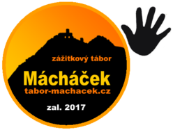
Primary Raster
Primary LogoPrimary shape: circle
Brand Codes
Summer Camps and Winter Theater
The brand focuses on summer camps (TÁBORY) and winter theater (DIVADLO), creating a seasonal rhythm and tradition.
Czech Language
The website is entirely in Czech, emphasizing its local roots and target audience.
Blue Accent
The shade #007cba is used for primary buttons and links, creating a consistent visual element.
Noto Serif for Headings
Using Noto Serif for headings gives a classic and readable feel.
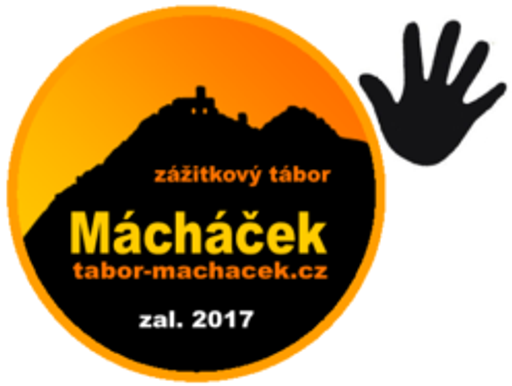
Circle with Mountain
A circular logo containing a stylized mountain silhouette with a castle on top.
Handprint Icon
A simple, solid black handprint icon is used as a visual element.
More brands in Nonprofit
Explore other brands in this industry to compare visual identities.