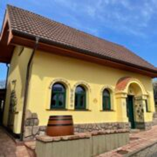
Vinařství Prokop
The InnocentServes Wine enthusiasts, local customers, families
What Drives Them
Values simplicity and honesty. Trusted for being genuine.
Color Intelligence
Vinařství Prokop anchors on a muted Blue (#c3d0d2) as their primary brand signal, paired with Yellow (#605f2c), and accented by Yellow. The palette leans warm — inviting and energetic.
#c3d0d2
Primary
#605f2c
Secondary
#8e8534
Accent
#777960
Accent
#3c3c3c
Text
#aaaa9b
Background
Typography
Single-font system — disciplined and consistent.
Logo Anatomy
Brand Character
Vinařství Prokop is warm and approachable, energetic and passionate.
first_plural
middle_school
direct
Signature Words
Design Playbook
Vineyard photography, Wine bottle product shots, People in vineyard
natural
full_color
horizontal
rounded
comfortable
image_carousel
Digital Footprint
Built on WordPress.
Market Presence
Local market, headquartered in Krumvíř, CZ.
CZ
Krumvíř, CZ
local
cs
Vinařství Prokop is a trademark of its respective owner. Bivernado is not affiliated with, endorsed by, or sponsored by Vinařství Prokop. All brand data shown here is collected from publicly available sources and analyzed for informational and research purposes under fair use principles. Request removal →
Brand Codes
Family Tradition
The winery emphasizes its family tradition and generational experience in winemaking.
Regional Origin
The winery highlights its location in the Krumvíř wine region, emphasizing its regional identity.
Vineyard Location Names
Wines are named after specific vineyard locations.
25 Years
Reference to 25 years of tradition.
Elegant Script
The brand uses an elegant, flowing script typeface for its name, 'Vinařství Prokop'.
Vineyard Scenery
The brand uses blurred, scenic photography of vineyards as a background.
More brands in Wine
Explore other brands in this industry to compare visual identities.