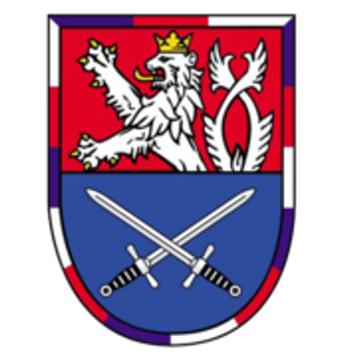
Mikroregion Radbuza
The Innocent“Mikroregion Radbuza”
Serves Residents of the Radbuza microregion
What Drives Them
Values simplicity and honesty. Trusted for being genuine.
The brand focuses on regional development, community, and cooperation within the Radbuza microregion. It aims to foster a sense of belonging and shared identity through local projects and information access.
Color Intelligence
Mikroregion Radbuza anchors on Green (#76ba49) as their primary brand signal, paired with Blue (#078ed5), and accented by Green. The palette leans cool — projecting trust and professionalism.
#76ba49
Primary
#078ed5
Secondary
#e7f4e5
Accent
#5ab1e6
Accent
#40a5d9
Accent
#000000
Background
Typography
Mikroregion Radbuza uses Open Sans across both headings and body — a sans-serif — clean, modern, and optimized for digital. Single-font system — disciplined and consistent.
Logo Anatomy
Brand Character
Mikroregion Radbuza is formal and professional, authoritative and decisive.
third
high_school
direct
Signature Words
Design Playbook
Digital Footprint
active on 1 social platform.
Market Presence
Regional presence, based in CZ.
CZ
regional
cs
Mikroregion Radbuza is a trademark of its respective owner. Bivernado is not affiliated with, endorsed by, or sponsored by Mikroregion Radbuza. All brand data shown here is collected from publicly available sources and analyzed for informational and research purposes under fair use principles. Request removal →
Brand Codes
Regional Identity
Focus on the Radbuza region and its municipalities.
Radbuza Blue
Dominant use of #146d8c across the website for links and headers.
Open Sans UI
Consistent use of Open Sans for navigation and user interface elements.
Products & Business


Showing 8 of 12 product images
More brands in Government
Explore other brands in this industry to compare visual identities.