Pedikúra-Manikúra-Katka
The CaregiverWhat Drives Them
Puts people first. Builds trust through genuine care.
Color Intelligence
Pedikúra-Manikúra-Katka anchors on a muted Orange (#442e26) as their primary brand signal, paired with Orange (#695048), and accented by Red. The palette leans warm — inviting and energetic.
#442e26
Primary
#695048
Secondary
#ebcfcf
Accent
#c6a7a2
Accent
#a28171
Accent
#7bdcb5
Accent
Typography
Headings set in Mako (a sans-serif — clean, modern, and optimized for digital), body in Mako:regular (a sans-serif — clean, modern, and optimized for digital). 4 typeface families in play — a richer, more layered typographic system.
Logo Anatomy
Brand Character
Pedikúra-Manikúra-Katka is warm and approachable, energetic and passionate, simply spoken and accessible.
first_singular
high_school
soft
Signature Words
Design Playbook
Digital Footprint
Built on WordPress, active on 2 social platforms.
Market Presence
Local market, based in CZ.
CZ
local
cs
Pedikúra-Manikúra-Katka is a trademark of its respective owner. Bivernado is not affiliated with, endorsed by, or sponsored by Pedikúra-Manikúra-Katka. All brand data shown here is collected from publicly available sources and analyzed for informational and research purposes under fair use principles. Request removal →
Brand Codes
Katka
The business is named after and likely features the founder.
e9e4e4
Light gray used as a background color, creating a soft and clean feel.
Mako
Used for headings, providing a modern and elegant look.
Script Logo
The logo uses a flowing, handwritten-style script font.
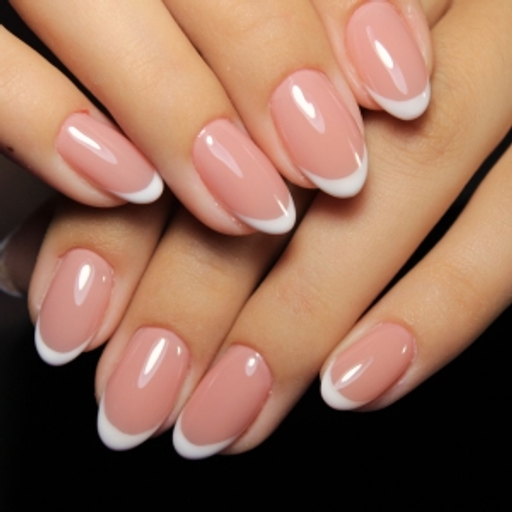
Close-up Nail Art
Close-up photography showcasing detailed nail art and manicures.
Social Media Intelligence
More brands in Beauty
Explore other brands in this industry to compare visual identities.