Mega Fitness
The Everyman“Z DÚVODU VÝUKY PRAXÍ”
Serves Adults seeking fitness training and nutritional guidance
What Drives Them
Relatable and down-to-earth. Connects through belonging.
Color Intelligence
Mega Fitness anchors on Green (#6cd33f) as their primary brand signal, paired with Green (#466d38), and accented by Gray. The palette leans cool — projecting trust and professionalism.
#6cd33f
Primary
#466d38
Secondary
#8d918c
Accent
#65ac48
Accent
#b7b9b8
Accent
#343634
Background
Typography
Headings set in Fjalla One (a sans-serif — clean, modern, and optimized for digital), body in Montserrat (a sans-serif — clean, modern, and optimized for digital). 3 typeface families in play — a richer, more layered typographic system.
Logo Anatomy
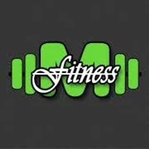
Mega Fitness uses a combination mark — pairing symbol with wordmark for versatility. Moderate detail — balancing distinctiveness with versatility. Style: modern, clean, geometric.
Combination Mark
circle
Icon + Text
5/10
Brand Character
Mega Fitness is authoritative and decisive, energetic and passionate.
first_plural
high_school
direct
Signature Words
Design Playbook
action, fitness, studio
natural
full_color
flat
top
rounded
comfortable
image
Yes
Digital Footprint
Built on Squarespace, active on 2 social platforms, offers dark mode.
Market Presence
Local market, headquartered in Prague, CZ.
CZ
Prague, CZ
local
en
Mega Fitness is a trademark of its respective owner. Bivernado is not affiliated with, endorsed by, or sponsored by Mega Fitness. All brand data shown here is collected from publicly available sources and analyzed for informational and research purposes under fair use principles. Request removal →
Logo Variants
Primary Raster
Primary LogoPrimary shape: circle
Brand Codes
Lime Green
Used for accents and calls to action.
Montserrat
Used for headings, providing a modern and bold look.
Jsme fitko v Praze
Repeated in the description.
Fitness Script
The word "Fitness" is written in a flowing, cursive script with a white outline.
Barbell M
The letter "M" is stylized to resemble a barbell, with the vertical strokes of the "M" acting as the weights.
Social Media Intelligence
More brands in Fitness
Explore other brands in this industry to compare visual identities.