Nezabudice - obecní úřad
The Innocent“Obec Nezabudice - Oficiální stránky obce Nezabudice”
Serves Residents of Nezabudice
What Drives Them
Values simplicity and honesty. Trusted for being genuine.
Color Intelligence
Nezabudice - obecní úřad anchors on a vivid Yellow (#f5c302) as their primary brand signal, paired with Blue (#0142a6), and accented by Gray. The palette leans warm — inviting and energetic.
#f5c302
Primary
#0142a6
Secondary
#63665f
Accent
#fefefe
Background
#d3d3d3
Accent
#1f273b
Accent
Typography
Nezabudice - obecní úřad uses Open Sans across both headings and body — a sans-serif — clean, modern, and optimized for digital. Single-font system — disciplined and consistent.
Logo Anatomy
Nezabudice - obecní úřad uses a wordmark — the brand name IS the logo, relying on typography alone. Minimal complexity — clean and scalable across all touchpoints. Style: formal, clean.
Wordmark
rectangle
Text
3/10
Brand Character
Nezabudice - obecní úřad is formal and professional, authoritative and decisive.
third
middle_school
formal
Signature Words
Design Playbook
Digital Footprint
.
Market Presence
Local market, based in CZ.
CZ
local
cs
Nezabudice - obecní úřad is a trademark of its respective owner. Bivernado is not affiliated with, endorsed by, or sponsored by Nezabudice - obecní úřad. All brand data shown here is collected from publicly available sources and analyzed for informational and research purposes under fair use principles. Request removal →
Logo Variants
Primary Raster
Primary LogoPrimary shape: rectangle
Brand Codes
Gold (#f5c302)
Used for accents and highlights.
Municipal Symbolism
Likely uses local symbols or imagery.
Coat of Arms
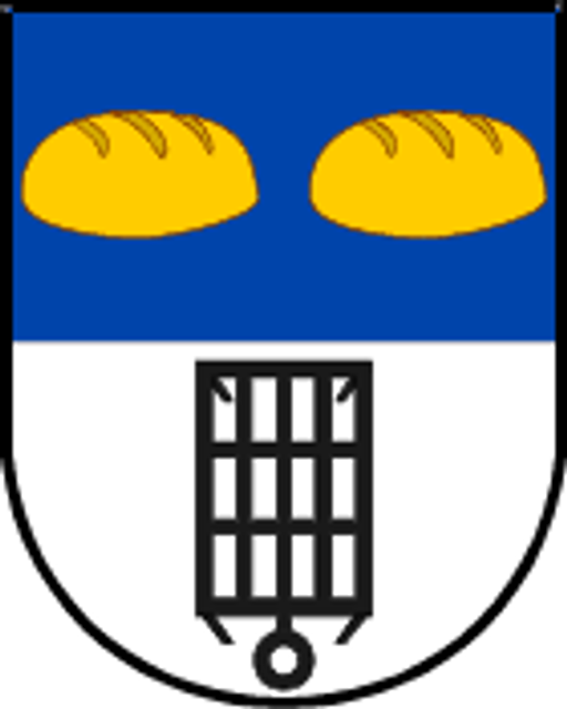
The coat of arms features two golden loaves of bread on a blue field above a black cage-like structure on a white field.
More brands in Government
Explore other brands in this industry to compare visual identities.