nutt.cz
The CaregiverServes Environmentally conscious consumers seeking natural and vegan skincare products.
What Drives Them
Puts people first. Builds trust through genuine care.
Color Intelligence
nutt.cz anchors on Red (#de4c35) as their primary brand signal, paired with Green (#82c83b), and accented by Yellow. The palette leans warm — inviting and energetic.
#de4c35
Primary
#82c83b
Secondary
#e0d8ab
Accent
#313a1b
Accent
#dbcb37
Accent
#697e36
Accent
Typography
Headings set in Montserrat (a sans-serif — clean, modern, and optimized for digital), body in Karla (a sans-serif — clean, modern, and optimized for digital). 3 typeface families in play — a richer, more layered typographic system.
Logo Anatomy
Moderate detail — balancing distinctiveness with versatility. Style: minimalist, organic, natural.
icon_symbol
circular
Icon
4/10
Brand Character
nutt.cz is casual and conversational, authoritative and decisive, warm and approachable — also energetic and passionate and simply spoken and accessible.
first_plural
middle_school
soft
Signature Words
Design Playbook
product-focused, lifestyle
natural
vibrant
flat
dropdown
rounded
comfortable
image
Digital Footprint
Built on Bootstrap, active on 1 social platform.
Market Presence
Nationwide presence, based in CZ.
CZ
national
cs
nutt.cz is a trademark of its respective owner. Bivernado is not affiliated with, endorsed by, or sponsored by nutt.cz. All brand data shown here is collected from publicly available sources and analyzed for informational and research purposes under fair use principles. Request removal →
Logo Variants
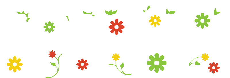
Primary Raster
Primary LogoPrimary shape: circular
Brand Codes
Bamboo Packaging
Products are packaged in ecologically sustainable bamboo containers.
Ghanaian Origin
Emphasizes the origin of ingredients from Ghana and the connection to local women.
5 Kč Donation
For every product purchased, 5 Kč is donated back to the village in Ghana.
Nutt font
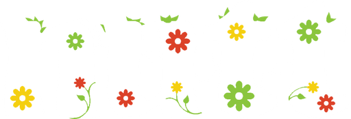
The brand name "nutt" is written in a distinctive, playful font with floral elements incorporated into the letters.
Bamboo jar
The product is packaged in a clear glass jar with a bamboo lid and a brown label.
Fruit illustrations
The product label features small, simple illustrations of fruits and other natural elements.
Floral Typography
The logo uses a playful, floral-themed typography with flowers and leaves incorporated into the letters.
Natural Ingredient Staging
The product photography features the product alongside its natural ingredients (tangerine slices and neroli blossoms), emphasizing the organic nature of the product.
Social Media Intelligence
More brands in Cosmetics
Explore other brands in this industry to compare visual identities.