RÁDCHENKO
The Caregiver“Permanentní make up Praha - Nechte vyniknout váš přirozený půvab”
Serves Women seeking permanent makeup solutions
What Drives Them
Puts people first. Builds trust through genuine care.
Color Intelligence
RÁDCHENKO anchors on Orange (#e1c7a8) as their primary brand signal, paired with Orange (#fdf1db), and accented by Orange. The palette leans warm — inviting and energetic.
#e1c7a8
Primary
#fdf1db
Secondary
#ce9f73
Accent
#a97a51
Accent
#70431e
Accent
#120a04
Text
Typography
Headings set in ResistText (a sans-serif — clean, modern, and optimized for digital), body in TildaSans (a sans-serif — clean, modern, and optimized for digital). 3 typeface families in play — a richer, more layered typographic system.
Logo Anatomy
RÁDCHENKO uses a combination mark — pairing symbol with wordmark for versatility.
Combination Mark
Icon + Text
Brand Character
RÁDCHENKO is authoritative and decisive, warm and approachable.
third
high_school
soft
Signature Words
Design Playbook
Digital Footprint
active on 2 social platforms.
Market Presence
Local market, headquartered in Prague, CZ.
CZ
Prague, CZ
local
cs
RÁDCHENKO is a trademark of its respective owner. Bivernado is not affiliated with, endorsed by, or sponsored by RÁDCHENKO. All brand data shown here is collected from publicly available sources and analyzed for informational and research purposes under fair use principles. Request removal →
Logo Variants
Primary Raster
Primary LogoBrand Codes
Beige
Used in the website design, #e2c8aa
ResistText
Used for headings, providing a modern and elegant look.
RÁDCHENKO
The business is named after the founder.
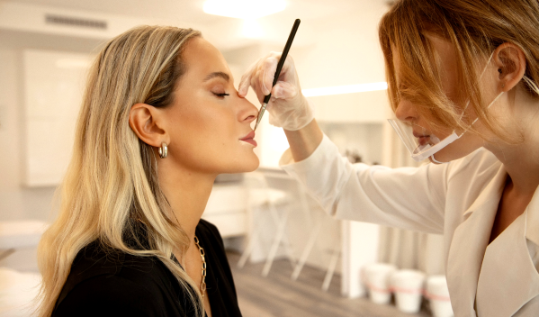
Clean Beauty Aesthetic
The photography features a clean, bright aesthetic with a focus on natural light and a minimalist background, emphasizing the beauty treatment and the subject's features.
Social Media Intelligence
More brands in Cosmetics
Explore other brands in this industry to compare visual identities.