Kosmetika Capri
The CaregiverServes Individuals seeking natural and gentle skincare products
What Drives Them
Puts people first. Builds trust through genuine care.
Color Intelligence
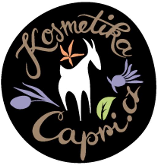
Kosmetika Capri anchors on a muted Blue (#23233d) as their primary brand signal, paired with Red (#fe968b), and accented by Orange. The palette leans warm — inviting and energetic.
#23233d
Primary
#fe968b
Secondary
#302924
Accent
#98826e
Accent
#62564c
Accent
#adadb4
Accent
Typography
Headings set in staywildy (a handwritten style — projecting personality and human warmth), body in Montserrat (a sans-serif — clean, modern, and optimized for digital).
Logo Anatomy
Brand Character
Kosmetika Capri is warm and approachable, energetic and passionate, simply spoken and accessible.
third
middle_school
direct
Signature Words
Design Playbook
product-focused, natural light
natural
realistic
flat
dropdown
rounded
comfortable
image
Digital Footprint
active on 1 social platform.
Market Presence
Nationwide presence, based in CZ.
CZ
national
cs
Kosmetika Capri is a trademark of its respective owner. Bivernado is not affiliated with, endorsed by, or sponsored by Kosmetika Capri. All brand data shown here is collected from publicly available sources and analyzed for informational and research purposes under fair use principles. Request removal →
Brand Codes
Teal Accent
The teal color (#5dc0b0) is used for buttons, headers, and other key elements, creating a fresh and natural feel.
Natural Milk
The brand emphasizes the use of natural milk in its cosmetic products.
La Chévre & Le Chaton
The brand uses French-inspired names for its product lines, adding a touch of elegance.
Czech Origin
The brand highlights its Czech origin and production.
Social Media Intelligence
More brands in Cosmetics
Explore other brands in this industry to compare visual identities.